
Web Spotlight
At SWARM, while we’re pretty focused on new products coming out of the digital space, we’re also interested in how they’re marketed and what those attempts mean about the brands they represent. Every now and then, its good to step away from focusing on app design and development and go back to our art school roots to discover the different meanings that brands try to project. Check out WELTRADE for instance.
Let’s have a look at “interactive websites”, these are secondary experience sites that brands produce as a form of advertising. If you’re thinking, “hey, isn’t a website interactive by definition”? I would like to point you to “Wikipedia” or one of the other million sites with a lack of interactivity. Let’s no get into a conversation about whether Wikipedia hits its experience mark. Let’s say that an informational site doesn’t need to be interactive, it simply needs to be easy to understand.
Think about this in the context of the web and what it was used for in its hay-day at CERN. In short, it was an academic resource first and foremost, and those do not need interaction. When we use the term “interactive website” we mean the type of site where there isn’t necessarily a clear menu. Consideration hasn’t been placed on all the different aspects of its use. In the interactive site the experience of the project takes a position of value than the content of the project.
Checking it Out
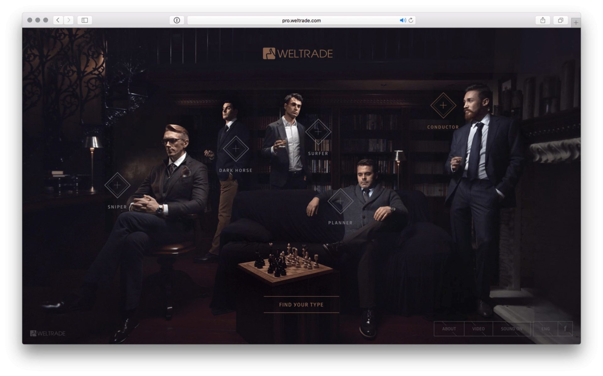
Let’s checkout pro.weltrade.com as a design piece and break it down to is core elements. A big frustration for users is when a site auto-plays music. It gets exponentially worse if you’re the type of user to have multiple browser windows open. When those tabs are small at the top of the browser, it becomes difficult to tell which tab’s playing sound. In chrome if the tab is a bit expanded, it’ll show an audio mic, so you can find the culprit).
This interactive website, pro.weltrade.com, does just that, but handles the muting of the sound in a way that is rarely seen. I move to click the icon that turns the sound off for the site. Instead of muting it immediately, the site uses a slow ease-out so the music dissipates. It’s a great move to continue the atmosphere of the entire interactive project in this piece. Importantly, when I refreshed the page, the site remembered my off setting and didn’t restart the sound. That’s good usability and experience design.
So what is this project about? The project takes different personas in trading (its a Weltrade product) and reveals them to us in a mysterious, sophisticated (debatable), and unconventional series of interactive videos. As the user clicks to learn more about each aspect, there is a subtle but visible call to action, beckoning us to “Become a Trader.” The visual experience is that of moving paintings. The set is dimly lit, with a soft light on the subjects center, allowing us to see their slight facial motions. The effect is a little uncomfortable perhaps. As a team member in the office walked by and looked at my screen, I could hear beyond my headphones a muttering of “thats so weird”.
What We Learned
The entire piece is an interesting approach to equate a lifestyle with the Weltrade brand. This is emphasized by the useless but “cute” test they ask you to take to learn your trading type. “Which type of car would you buy?” The final effect of the quiz is pleasant, no matter which role is picked for you, each is shown in a positive light, full of flattery. The experience finally breaks down when the CTA is hit and you’re moved to their main site, a generic form, with the general white palette in strong contrast to the dark of the previous site. After taking the viewer through an experience of brand, landing them in this new landscape feels off-brand. Most importantly, the entire new and high-end view of the trading experience has shifted in our psychology back to the old and boring view we had before we jumped in.
Was that an effective use of the interactive site? I’d suspect continuing the ambiance throughout would create a better long term impression. It certainly would be interesting to see the conversion rates for this project – was it successful?