Serving the Overlooked
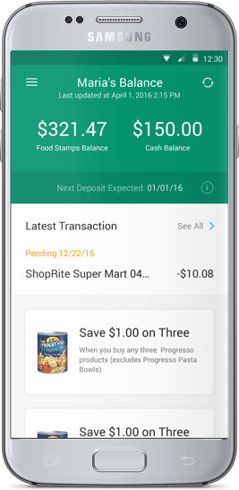
Fresh EBT changes what it means to check your food stamp balance by providing a streamlined registration process, store locator, and data visualizer at your fingertips.
We helped give the Easy EBT app a visual makeover, rebranding the logo and refining the user interface.
The Propel team came to us with the goal to refine the designs for their Easy EBT app, while they were already working on the UX, they needed a sleek visual design to create an emotional feeling of a premium financial product for its constituents.
EASY OR FRESH?

Going into the project we set out to create a new logo and app icon that represented both the financial and grocery elements of the product. We focused on three main concepts that resonated with the brand: connectivity, food, and finance.

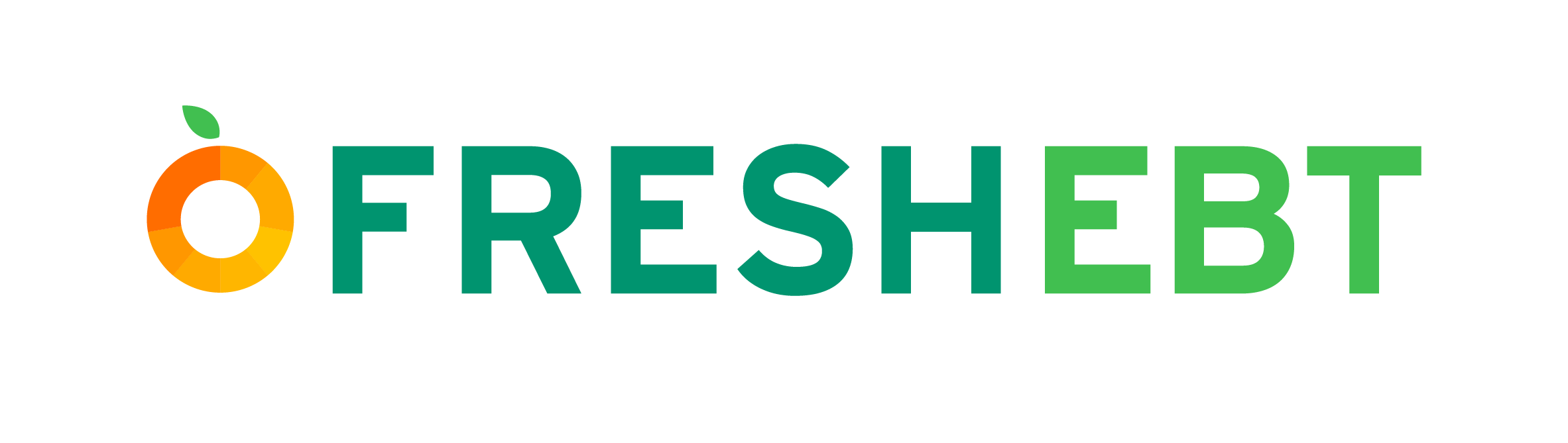
Working closely with Propel, we quickly iterated on proposed logos and icons, narrowing down the choices to only a handful. However, during the process, the client decided they wanted to change the name of their product to better communicate their mission, hence the name Fresh EBT was born.
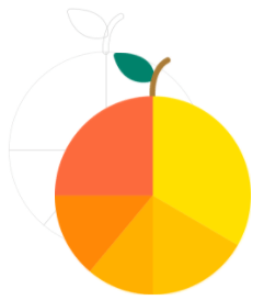
Once the name for the company was cemented, we returned to crafting the logo and icon. We had to alter our workflow to include more rapid views in order to deliver the final designs within the specified deadline. We played around with the idea of combining a pie chart with that of a fruit–something fresh, fun, and playful–that would incorporate the three important elements of their brand identity. After a few round of close collaboration, we came up with the icon and logo that truly embodies the Fresh EBT brand.
THE USER INTERFACE

Improving the registration flow was of great importance for the client, as it had previously presented a problem for them. State EBT portals were notorious for obtuse registration, and Fresh EBT was beholden to these flows, however, that didn’t mean they couldn’t be improved upon.
We defined ways in which to improve retention, and lessen the burden on someone signing up to the platform, greatly reducing complexity.

Interface design wise our team explored various color and style directions. These explorations ranged from vivid and playful to stark and fresh. After a few iterations, we settled on the metaphor that Fresh EBT should resemble a well dressed and approachable man who was eager to assist.
In the end, we chose a UI style that was clean and simple. We kept in mind accessibility concerns such as font size, contrast, and color blindness. For the color we settled on a cool green that gives off the feeling of a strong, yet humble men’s cologne.
GOING FORWARD
After launching the app under a new name, Fresh EBT continues to receive on average 4+ star ratings on both the Google Play and iOS app stores.

Darien
Design

Nico
Design

Valerie
Product
The New York Times Start-Ups Aim at Overlooked Demographic: The Unbanked
The Plural of You Making Food Stamps User-Friendly – Jimmy Chen (POY 01)