Let’s Hit the Links
GolfMatch brings together people who are passionate about the sport–to learn from each other, to be competitive with each other, and to build relationships with each other over their shared enthusiasm.
When the GolfMatch team first came to us, they had a problem. Their app was acquiring new users, but there was not enough engagement within the app. Golfers were interested in the potential of GolfMatch, but something was lacking from their experience in the app to keep them coming back. We began by looking for user experience issues.
INITIAL DESIGN

Once identified, we built an app experience that was logical and intuitive. This let us test if the issue was because golfers didn’t understand how to use and get value from the app. Results of such testing would indicate whether new features were required. In this phase, we emphasized minimalism and individual pieces of content rather than filling the screen up with multiple interactions or a content full stream of information.
WHEN THINGS CHANGE

Mid way through the project,we were thrown a trick on the course. The GolfMatch team onboarded a new CTO who brought with him the his former app, Social Par. Strategically, GolfMatch sought to repurpose Social Par’s code to integrate new features that would test whether a more social-first experience would be more exciting for golfers. By doing it this way, they also saved countless development hours and were able to meet their tight deadline.
STARTING OVER
What this meant for us was that we had another round of user experience design to explore, with these new features in consideration.
In order to create a great user experience we had to start from scratch to fit the design for a new social-focused experience.
To deliver the full power of social into GolfMatch, we drastically changed the structure and feel of the product. We did this by first learning about how golfers communicate with each other to form relationships and communities around their passion.
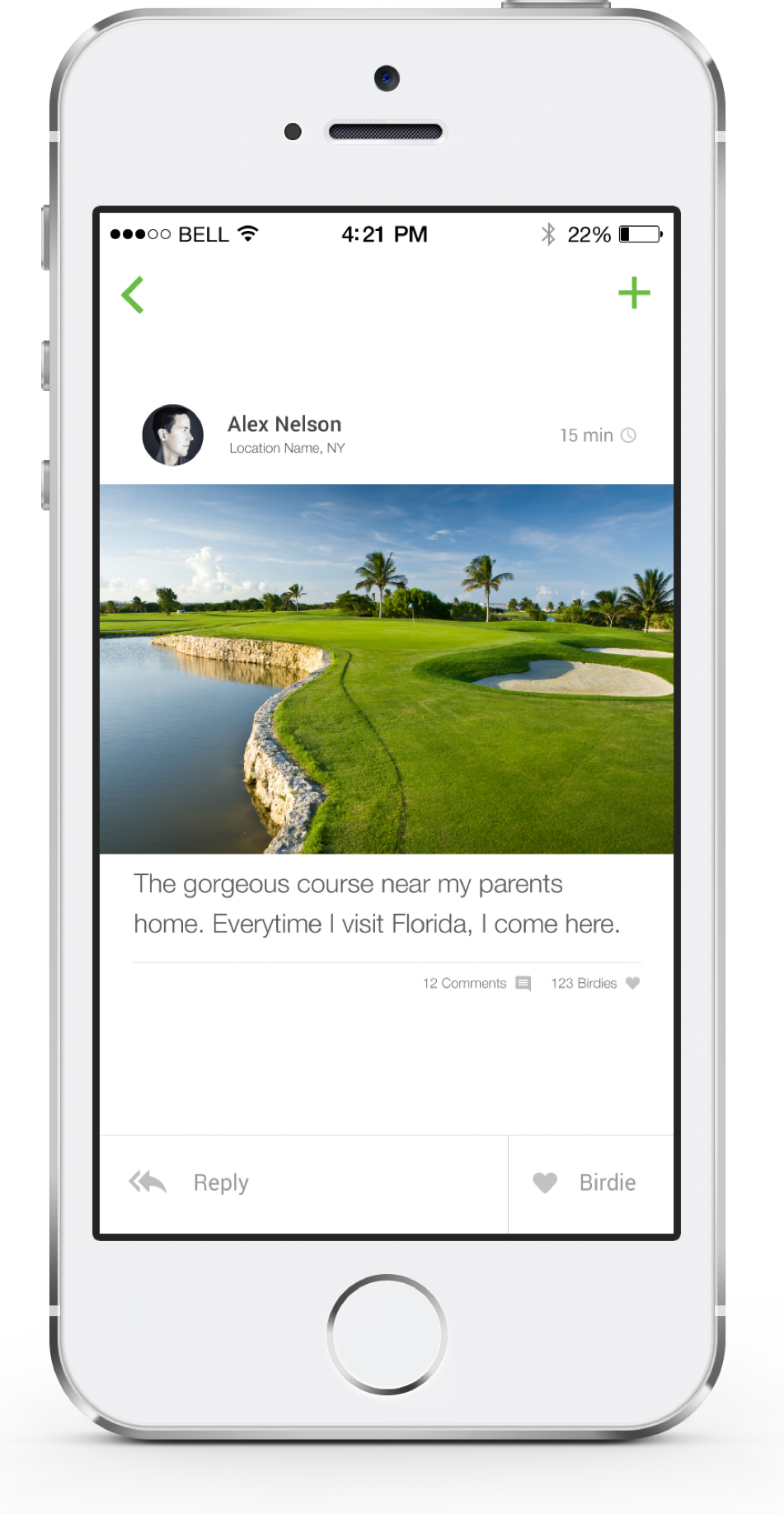
Through experimentation, we found that golfers crave golf news, love posting photos of beautiful and challenging courses, and get excited about discussing golfing techniques and helping each other get better. With this knowledge, we focused our new experience around a newsfeed that types of sharing interactions at the forefront.

We also discovered that there were two distinct approaches to how Golfers approached the pairing up with others to play a round.
The challenge became satisfying both types of users without forcing each other’s system on the other in the UX. It’s pretty hard to define two distinct pathways within an app without interfering with usability, and we’re proud of the outcome.
5 STAR APP
Since it’s launch, the GolfMatch user base has been actively expanding, and engagement within the app has increased. Users are now constantly posting new content and the app feels live. GolfMatch has 5/5 stars in the App Store, and the company has been featured on Fox Business, in Sports Illustrated, and Golf.com, among others.


WHAT WE LEARNED
Sometimes the road to what seems, in hindsight, like a simple solution requires a good amount of iteration. You know it once you’ve hit that optimum and suddenly your product is speaking the language of the people who use your product (whether they’re golfers, music fans, or selfie-enamored tweens) because they start chatting back.

Somya
Engineering, Product

Valerie
Design, Product

Fox Business Elevator Pitch: Golfmatch App A Hole In One?
GolfDigest So Long To Single Life
Sports Illustrated Gold+ A Few of Our Favorite Things