Complexion Reduction: A New Trend in Design
We have been living in a world of ‘clean and minimal’ for quite some time, so what’s next?
Over the last several months, some of the leaders of innovative design have taken ‘minimal design’ to the next level. Facebook, Airbnb and Apple have followed a similar blueprint to simplify prominent products in a way that reflects this new trend of ‘Complexion Reduction’ in mobile design.
WHAT THE HELL IS ‘COMPLEXION REDUCTION’?
You’ve never heard of ‘Complexion Reduction’ you say? Well yea, that’s because I just made the term up. Recently I’ve noticed a new trend that is beyond flat design, beyond minimal design and independent of progressive reduction. Some may claim that this is just the next step of minimal design in the mobile realm but I say it is something more distinct. There are specific similarities and characteristics that define this new trend. So I decided to name it. I’m allowed to do that, right?
The defining characteristics of this hot new trend sweeping across Silicon Valley are:
- Bigger, bolder headlines
- Simpler more universal icons
- Extraction of color
The result? The user interfaces of some of our favorite apps are starting to look more and more like they could all be housed under the same brand.
THE PROOF
I first started taking notice of this trend back in early May when Instagram released their redesigned UI.
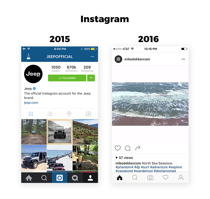
Some of the changes they introduced included removing much of the blue and dark grey color used throughout the app, making headlines bolder and simplifying the bottom navigation and icons. What was left was a black and white UI with bold headlines where the content shined and functionality was clear. I appreciated the less cluttered interface and was reminded a bit of a platform I have been an admirer of for quite some time: Medium. Medium has been rocking the black and white since launch in 2012, and has reduced clutter with each redesign since; effectively making Medium one of the originators of CR (Complexion Reduction) without even knowing it. Congratulations, Medium!
Shortly after the folks over at FB unveiled Instagram’s look, I opened up the Airbnb app and was struck by how familiar it looked. This was my first time browsing the app since they released a redesign in April, yet I felt like I had seen this all before.
Airbnb

Airbnb’s redesigned UI didn’t get nearly the media coverage of Instagram’s redesign a month later (partly because it wasn’t accompanied by a shiny new app icon) but it followed many of the same CR tactics.
The mobile redesign introduced larger, bolder headlines, removed unnecessary imagery and color and simplified their icons to make them more universally recognizable. What was left was a very black and white UI where the content shined and functionality was clear.
Apple is the latest example of designers becoming enamored by the Complexion Reduction movement. Earlier this month, at Apple’s WWDC the tech giant announced a number of exciting things for consumers to look forward to, including the release of iOS 10, which they are dubbing, “The biggest iOS release ever!” (or at least since iOS 8 which was referred to as… “The biggest iOS release ever!”)
Apple Music
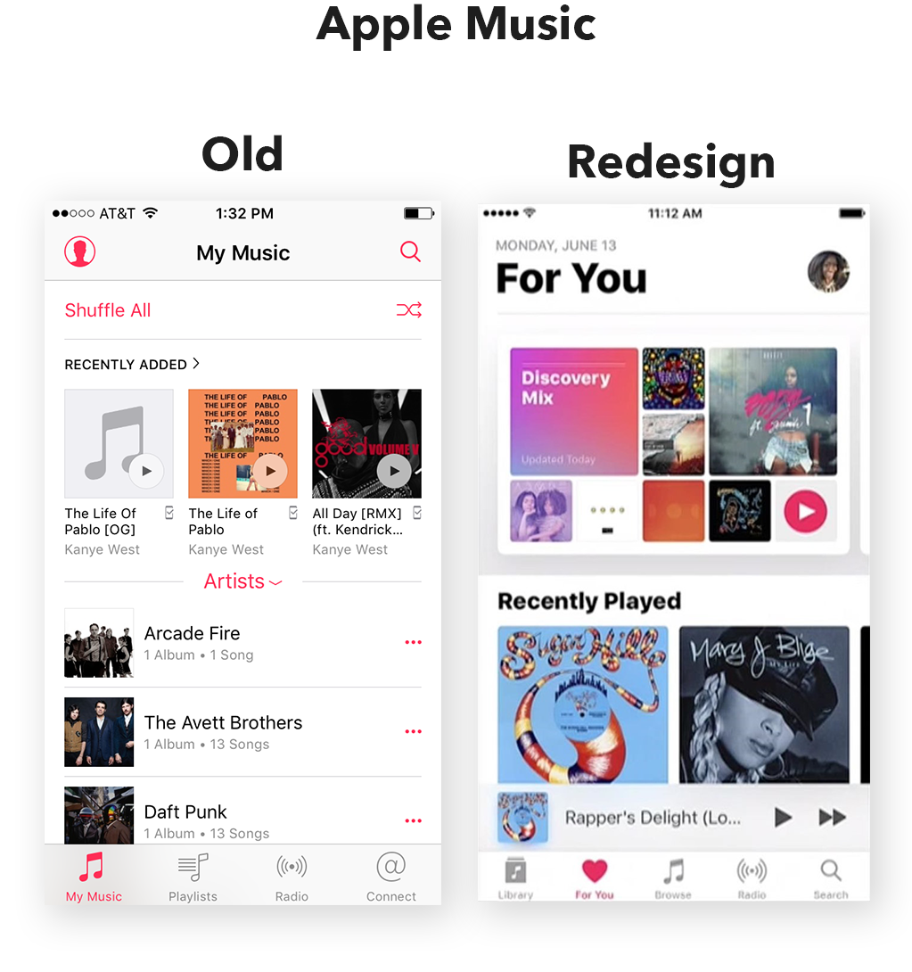
One announcement in particular caught my eye. That was the redesign of Apple Music. While the most important aspects of the redesign are UX updates and additional features, the ascetic was the first thing I noticed. Caitlin McGarry, a staff writer at Macworld, described the updated appearance well, “It’s a totally new look, with giant cards, bigger and bolder fonts, and a clean white background that allows the album art to shine.”
Sound familiar? The design differs slightly from the blueprint used by Instagram and Airbnb (they use solid icons! What the heck Apple?) but the key elements are there: large bold headlines, black and white UI.
SO WHAT DOES IT ALL MEAN?
As I mentioned earlier, this means more and more of your favorite apps are going to start looking like one another. Why? Much like the NFL, tech is a copycat league. These redesigns were met with generally positive reviews (some people are complaining about a ‘lack of personality’ in these new black and white UIs but they’ll soon get over that. You open an app for it’s functionality, not it’s personality) so I expect apps both new and old to start jumping on the CR bandwagon.
This means your iPhone home screen will soon become nothing more than a colorful mosaic of bright portals transporting you to Pleasantville.

Now, whether you are for or against this monochromatic fad, it is undoubtedly a sign of progress. The product design process is advancing and evolving from the old segmented approach that encouraged superfluous design to a more holistic process that truly is focused on the user. In the old product design process a UI designer may be handed wireframes by a UX or product person with the instructions ‘make it pretty’. That designer would then spend hours or days adding color, removing color, changing color when the best solution may have been right there in front of them all along… the wireframes! As the lines between UX and UI designer blur in today’s more integrated design process, designers become less worried about their specific responsibilities (like making it pretty) and focus on the ultimate goal of creating the best product for their user.
THE ULTIMATE GUIDE TO COMPLEXION REDUCTION
So you’re sold on CR and ready to hop on the bandwagon? Good, follow these guidelines and you’ll have an award winning app in no time.
1. Remove Color. Well ok, you can have one color, but use it extremely sparingly. Everything else better be black and white. Let the content of your app bring the color.
2. Bigger, Bolder, Blacker Headlines. You see that headline there? Bump it up about 20 to 30 pixels and make it HEAVY.
3. Simple, Thin, Recognizable Icons. Your icons better be universal and no color allowed here either. And if you want bonus points order them left to right in this way: home, search, primary action, secondary action, profile.
4. Double, NO, Triple your White Space. Maybe even quadruple it. You really can’t go wrong here.
5. Make your App Icon Brighter. If you are fiending to design something with flash and color, make it the app icon. This is where you put your personality and brand. And make it stand out!
A Quick Morsel from the SWARM Strategy Curmudgeon: Excel Shortcuts
Last year, I was approached by the sterling folks over at General Assembly, asking whether I would be interested in teaching a series of courses on Microsoft Excel. I happily oblige on the chance and the demand for these classes have been overwhelming; I’ve now taught live-stream and in-person sessions, and a series of quick-nibble Excel courses will soon appear on the Google for Entrepreneurs YouTube channel.
Indeed, Excel is one of those necessary evils for many business professionals. It seems like the learning curve for the software is relatively high. Just like your typical programming language, it’s hard to discover Excel’s features until you’re in the thick of it. It’s like learning to use a brake pedal while speeding down the BQE. One of the ways that Excel can become less of a burden is the use of Excel Shortcuts.
During my in-person courses, I encourage students to “let go of the mouse”. I have them attempt to navigate through their spreadsheets using only their keyboard. And while this takes time and practice, it’s certainly doable. (Ask some of your investment banking friends about this; they’ll probably laugh — then go into some mild form of PTSD reminiscing about their days as an analyst!)So, as a helpful resource to you all, here is a brief set of my favorite shortcuts in Excel — both for Windows and Mac! If you have any questions, feel free to comment below or send me a tweet!
Open for business.
Happy Days! After a few months of discussions regarding where we were headed with SWARM Digital Marketing, and what it is we wanted to do, we’ve made some decisions and we’re finally back, with a brand new site, a brand new blog, and a twitter feed to follow.
What we’ve become is a digital agency. We enjoy working with one another. We push each other. And we’re able to conceptualize and build products for our clients as well as ourselves. They are greater than the sum of their respective parts.
As for this blog, we’re looking forward to populating it with ideas about design, best practices, discussions about technology, product and strategy. But for now, it’s good to be back.